Here comes the time to design the communication around Aimo. But before we begin, why Aimo? What does this name even mean? Our name comes from a french saint called Aimo of Satigny who was known for his charitable kindness. As our mailbox offers a new way to share your goods with the people you love or the people around you, we found this was a sweet wink additionally to the nice and fleek way the word visually looks and phonetically sounds.
The first step for me was to find a Typeface that would fit our needs and vision. Aimo is an connected object that needs to be seen without taking too much attention. That’s how I pictured the font, discrete with a twist.
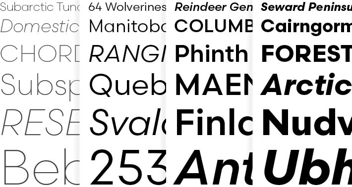
The typeface I chose is the Scandia Font by the Process Typefoundry. This is a geometric sans serif font with some lush curves at the angles. Elaborate but sober as Aimo will be!
The Aimo logo follows the same reflexion. With the I tilted to the A, it gives the twist I was talking about without being too much or too tinsel.
![]()
The next step was the UX Design, if you want to have a look at our design inspirations you can follow this link.
Until now I was designing apps and websites on Photoshop or Sketch and using Marvel to make interactive prototype. For the first time I am using the new app of the Adobe Creative Suite called User Experience. This software at last merges the two main aspects missing in other apps: being able to design and link directely inside the app the different templates to make a working and interactive prototype! For now I am very pleased with this new tool and I look forward to seeing how we the ux / web design world will evolve with this kind of software!